English Learning Platform,Designing an Engaging and Modern Learning
Creating a user-centered platform that makes learning English simple and enjoyable
About this project:
This project involved designing a complete online English learning platform from the ground up. The goal was to build a modern, approachable, and motivational learning environment that supports users in improving their grammar, vocabulary, and communication skills — whether for personal growth or exam preparation. The project covers every stage of design — from research and concept development to branding, UI design, and final delivery.
Project Info:
Role:
UX/UI Designer (End-to-End Design)
Scope:
UX Research, Wireframing, UI Design, Prototyping
Tools:
Figma, FigJam, Illustrator, Photoshop
Type:
Independent Concept Project
Problem & Opportunity
There are many English-learning websites, but most lack clear structure, consistency, and motivation.
Users often face confusing navigation, dull interfaces, and overwhelming lesson layouts. I saw an opportunity to design a learning platform that:
Feels welcoming and clear from the first interaction,
Uses color and layout to guide focus,
And keeps learners engaged through intuitive visual storytelling.
Design Goals:
Develop a complete brand identity that feels modern and educational.
Create a clean, modular UI that allows easy navigation between learning areas.
Improve user motivation with friendly visuals and meaningful interactions.
Ensure consistency and accessibility across all screen sizes.
Research & Insights:
To understand user expectations, I explored popular learning platforms such as Duolingo, Coursera, and BBC Learning English. I also analyzed user reviews and behavior patterns to identify common frustrations:
Confusing navigation systems.
Overcrowded pages with too much information.
Lack of visual motivation or progress tracking.
Key Insight:
A well-structured and emotionally engaging interface can make language learning feel achievable — not overwhelming.
Brand Style Guide:
Color Palette:
The visual identity was built to reflect energy, clarity, and friendliness. Warm, motivational tones (orange, peach) were combined with calm professional hues (navy, purple) to balance engagement with trust.
F0F0EE
8E8E96
EA5F28
AC8161
272B42
Typography:
Typography plays a central role in accessibility and tone. A modern sans-serif for titles and a clean, legible font for body text help maintain both clarity and warmth.
Visual Elements:
Custom illustrations and friendly icons were designed to support the learning context. Each section (Grammar, Vocabulary, IELTS, etc.) features an illustration that reinforces the concept and builds brand cohesion.
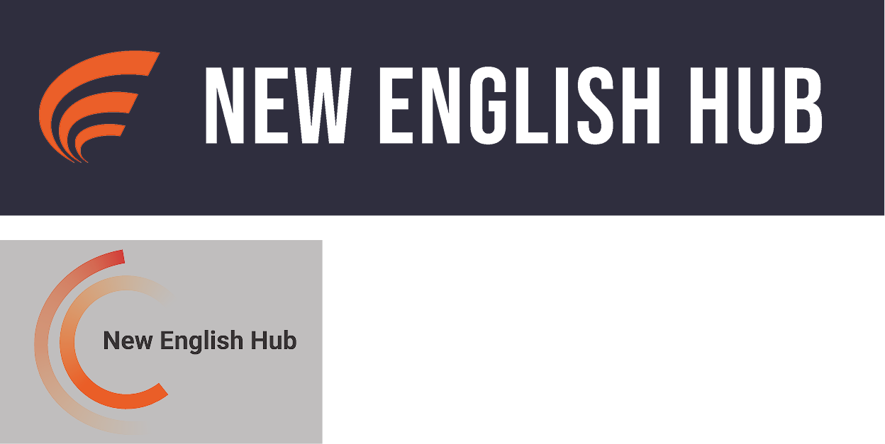
Draft Logos:
Company Name:
New English Hub
Company Slogen:
Learn English on your peace
Design Process:
1. Information Architecture The platform was structured around the key learning goals: Grammar, Vocabulary, Business English, IELTS, and Services. Navigation was designed to allow quick access to each area, minimizing user friction. 2. Wireframes Low-fidelity wireframes helped establish content flow and layout balance early in the process. The focus was on clarity, visual rhythm, and intuitive calls to action. 3. UI Design With the structure validated, I developed high-fidelity screens using the established brand system. Cards, illustrations, and spacious typography help keep content digestible and inviting. 4. Interaction & Responsiveness Interactive hover states, subtle animations, and adaptive layouts ensure a cohesive experience across desktop and mobile devices.
Final Design:
The final interface delivers a clean and organized experience:
Hero Section: Presents platform mission and main features.
Learning Modules: Clearly defined categories — Grammar, Vocabulary, Business English, IELTS.
Services Section: Personalized study plans, speaking sessions, and writing feedback.
Footer: Quick links to resources and community sections.
Each screen aligns with the platform’s core principle — making English learning friendly, efficient, and motivating
Outcomes:
Consistent Visual Identity: Unified colors, fonts, and illustrations create a recognizable brand feel.
Higher Engagement: Visually rich layout and motivational tone encourage continued learning.
Scalable Design System: Modular components can easily adapt for future courses or mobile app expansion.
Reflection & Next Steps:
Designing this platform from scratch allowed me to bring UX strategy, visual identity, and branding together in one cohesive system. Balancing educational depth with visual clarity was a key challenge — ensuring the interface feels engaging yet effortless to use. The next step will focus on developing the Grammar, Vocabulary, and IELTS course pages, all built upon the same design language. This Home Page lays the foundation for the platform’s brand system and represents a full end-to-end design process — from concept to refined execution.