A UX/UI redesign focused on simplifying filters and improving decision-making for travelers.
Overview
The goal of this project was to redesign Booking.com’s search and filtering experience to make hotel discovery faster and more intuitive. By simplifying the interface and improving the comparison flow, the redesign aims to reduce user frustration and help travelers make confident booking decisions. This concept focuses on enhancing usability through clarity, hierarchy, and efficient navigation.
Through user reviews and usability analysis, several pain points became evident:
Filters are scattered and visually dense, making it hard to find relevant options.
The search results page looks cluttered, causing cognitive overload.
Comparing hotels requires multiple tab switches and manual effort.
These issues lead to user frustration and increase the risk of drop-offs before completing a booking.
Design Goals
The main objectives of this redesign were:
Simplify the filter system to make it less overwhelming and more intuitive.
Declutter the search results page by emphasizing visuals and key information.
Create a clear comparison flow that allows users to evaluate hotels side by side.
Research & Insights
User Feedback Analysis: Reviews on the App Store and UX forums frequently mention
that filters are confusing and the interface feels outdated.
Competitive Benchmarking: Airbnb and Expedia were analyzed for their simplicity and
visual hierarchy in search and filtering flows.
Heuristic Evaluation: The interface violated several usability heuristics (notably
“Recognition rather than recall” and “Aesthetic and minimalist design”).
Design Process
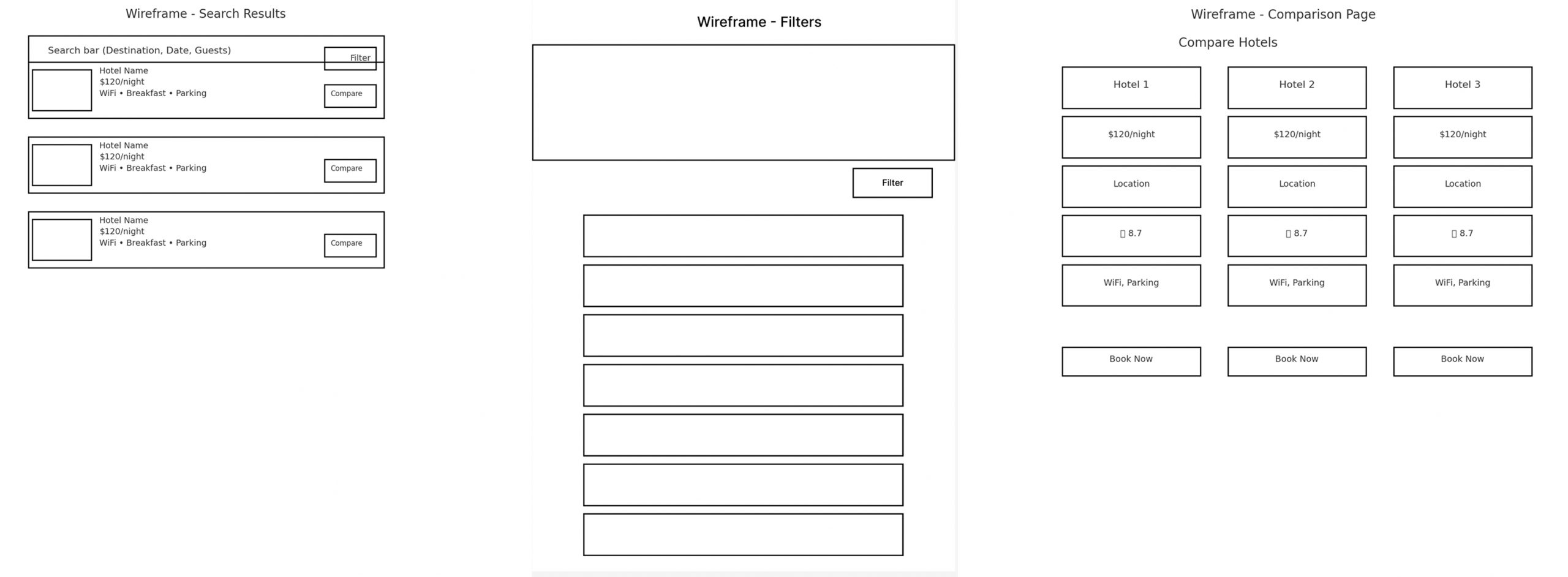
Wireframing
I started with low-fidelity sketches to restructure the layout:
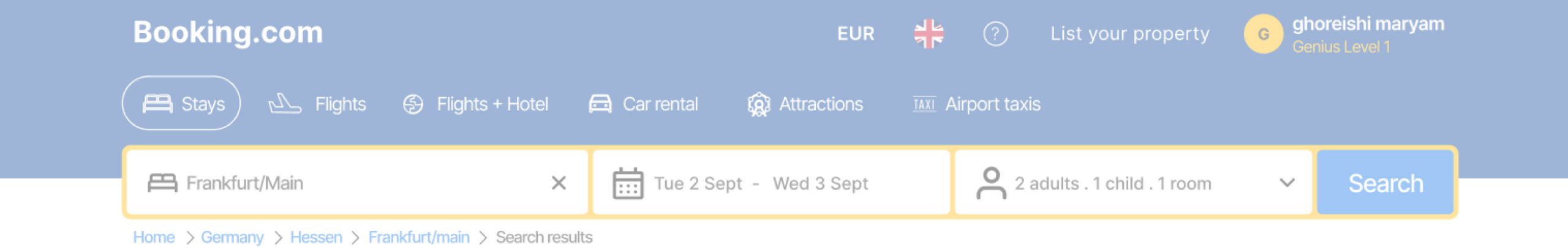
Placed the search bar at the top for quick access.
Designed collapsible filter sections (Price, Amenities, Rating, etc.) to reduce clutter.
Simplified hotel cards with large images, essential info (price, rating, amenities), and a “Compare” button.
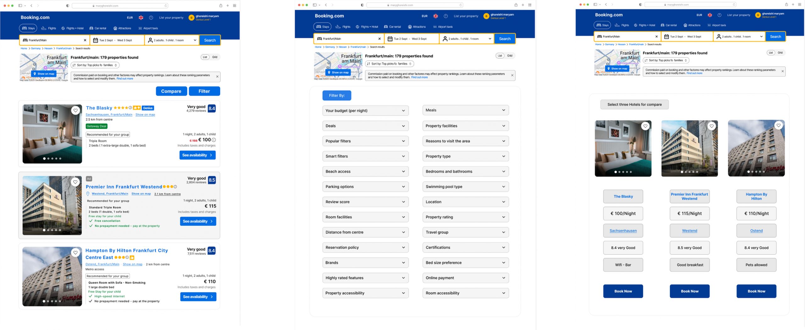
UI Design
Adopted a clean, minimalistic visual style consistent with Booking’s brand colors.
Used visual hierarchy to emphasize hotel images and pricing.
Created dropdown (accordion) filters with clear subcategories for better scanability.
Designed a comparison page showing hotels side by side with key metrics (price, rating, location, facilities).
Interaction Improvements
Users can expand one filter at a time to avoid information overload.
The “Compare” button dynamically updates a small toolbar allowing quick access to selected hotels.
On the comparison page, consistent visual elements help users make decisions faster.
Outcomes
Simplified navigation: Fewer visible elements at once, clearer content hierarchy.
Reduced decision fatigue: Users can now filter efficiently and compare hotels easily.
Enhanced aesthetics: A modernized, more consistent design aligned with contemporary UX patterns.
Reflection
This redesign demonstrates how small structural and interaction changes can significantly improve usability on complex e-commerce platforms. If implemented, it could reduce bounce rates and improve conversion, especially for first-time users. Future iterations could include usability testing and a responsive mobile version.